
3 Critical Things to Keep in Mind When Designing Custom Lapel Pins
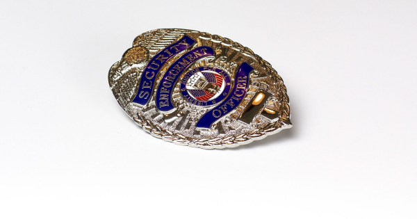
Lapel pins are considered one of the most important accessories for a police officer or government agent. To some people, a pin is more important than the official badge patch or emblem.
Suppose you are considering designing a lapel pin for your agency or department. In that case, you may want to keep a few factors in mind to ensure that the end product not only looks authoritative but professional as well. Read on to learn more.
Simplicity Matters
Some of the most outstanding pins only use two or three colors. When you look at an assortment of lapel pins, you will realize that the main reason why using many colors is not advisable is the size. Pins are typically tiny accessories that you will have on your clothing before you head out.
You should remember that one key function of professional emblems and pins is to do the introduction for you. If you make the mistake of designing your pin with a rainbow of colors, the people you interact with will not be able to make out your agency or department fast enough. Another key reason to avoid using too many colors is the cost. You want to work with fewer colors because they do not increase the production cost too much.
Think about what goes on in your mind when you see a limo pick a suited man with a US flag lapel pin. You will automatically associate him with a government agency. An official pin is similar to the uniform worn by police, EMS, and fire departments.
A simple design is more than the color you choose for the pin. You should think about your agency’s identity and the overall message you want to send using the pin. A good place to start is with the department’s logo. Given that most logos are extremely detailed, you can easily draw a simpler version of the logo and add a few touches to simplify the pin design.
The Edges Should Be Smooth
The edges of the pin design are just as important as the overall size of the accessory. You should avoid designing a lapel pin that has a tight squeeze around the edges. Such a design is undesirable since it allows some metal fill to remain on the end product. Most cutting tools are not rigged to cut the edges of the pins smoothly.
Sudden changes in contours should be well-defined on the pin design. A great way to do this is highlighting such details with a color change. For instance, when designing a US flag pin, raising the white stripes and sinking the red ones will make for a more sturdy design. The same thing applies to agencies such as the sheriff or highway patrol offices.
Choose Colors Wisely
How you choose colors is perhaps the most important design decision you can make. Filling various sections of the pin with a perfect color will make it stand out. If you want a lapel pin that mimics your department’s logo, you may follow the original emblem colors. However, you should not constrain yourself to the exact color shade as the logo if it does not make sense.
Sometimes, closely following the exact color shade will make your pins less appealing. In others, you may realize that keeping certain colors will have people confuse your agency for a different one. Given that pins are usually tiny compared to logos and emblems, some of the designs and colors you have in mind may not work. Do not shy away from making a few compromises by trying slight variations of your colors for a unique design.
The popularity of lapel pins can be traced back to the Ming Dynasty in 1271 AD. In the United States, pins and emblems are used by the 17,985 agencies that include police departments, Sheriff’s offices, federal agencies, and highway patrols. Today, pins have become even more popular as various organizations attempt to differentiate their workers in public.
A well-designed lapel pin not only appeals to an officer but adds an aura of authenticity and professionalism. Feel free to contact us today to learn more about the design tips discussed above.

