
Design Tips for Your Custom Firefighter Patch
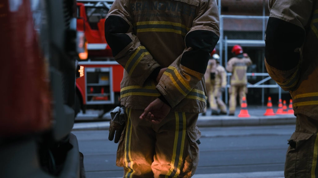
Firefighters play an important role by helping to control fire outbreaks and rescuing people trapped in house fire accidents. The impact of their jobs is mostly felt in densely populated areas. Statistics show that in 2018, 67% of professional firefighters worked in areas with a population of 25,000 or more. Needless to say, firefighters are important parts of keeping our day-to-day lives safe.
Fire departments employ embroidered patches to give themselves a unique identity. Patches have symbols and text inscriptions that help firefighters express their commitment to their department’s core objective while also making it simple for individuals in the communities they serve to recognize them. The symbolic nature of fire dept patches emphasizes the need for an excellent design. Here are some design tips for creating an excellent firefighter patch.
Make It Bold
Strong designs and bold writing are recommended for easy visibility. Traditional needlework procedures make it difficult to recreate delicate, tiny, and small writing. While developing fire dept patches, you should use thick and easily visible text. Thick and visible text makes fire dept patches more appealing, legible, and recognizable.
Simplicity Is Essential
When creating designs, most people prefer simplicity and avoid complexity. When it comes to patches, the same rule applies, and you should keep to a minimal design. Consider the most well-known patches, such as law-enforcement department patches, and you’ll see how straightforward they are. People easily recognize an organization’s patch when it has a straightforward and simple design.
Pay Attention to Border Colors
When creating fire dept patches, the border should not be disregarded. Remember that border-color might increase or decrease backdrop depth, which affects visibility. Border colors compliment the background and grab the most attention since they provide depth to it. Test out different colors in your borders to find which one causes your design to pop the most.
Contrast Matters
Humans are more predisposed to respond to contrast than to flatness. With the correct contrast, an emblem will be imprinted on the minds of anybody who sees it. A good illustration of this design principle is black and white patches, which have stood the test of time because they are easy to remember. This does not imply that you must adhere to a black and white scheme, but choosing a bold color scheme with adequate contrast can assist you in finding the perfect balance.
Consulting and exchanging ideas with a design company helps immensely in designing an excellent patch for your fire department. Always get a second opinion on your design, and don’t be afraid to make big changes. If you need design ideas and professional guidance for your custom fire dept patches, contact us today!

